
4D v13
Types of 2D graphs
 Types of 2D graphs
This section describes the types of two-dimensional graphs provided by 4D Chart. The following diagram shows a two-dimensional (two-axis) graph:
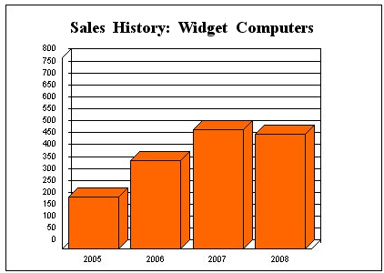
The X-axis is also called the Category axis. The X-axis displays the categories into which the information is divided. For instance, if you are graphing the number of computers sold per year, you would place the years on the X-axis.
The Z-axis is also called the Values axis. You use the Z-axis to display the values calculated for each category. In the computer sales example, the Z-axis would contain the values for the numbers of computers sold per year. For instance, if there were 500 computers sold in 2007, the Z-axis value corresponding to the X-axis category “2007” would be 500.
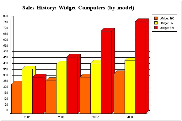
Another concept in graphing is the data series (or simply, series). Each category is composed of one or more series that further breaks down the information displayed in the graph. In this example, there was only one series, “computers sold.” But suppose we want to compare the sales of three different computer models. You can just have each model become a separate series on the graph. Each series shares the same categories (in this case, the years 2005 to 2008), but have their own values.
Another way to graph this data would be to create a three-dimensional graph of the data (see Types of 3D graphs).
You can use 2D graph options to change their appearance or certain mechanisms. To see the available options for a graph, double-click directly on it or choose Options from the Graph menu of 4D Chart.
Area graphs are commonly used to show the magnitude of values over time, but can show values over any continuous category.
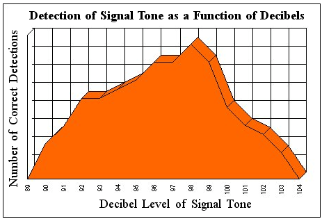
The categories on the X-axis should be continuous, such as times or temperatures.
Discrete categories, such as salespeople or products, are better suited to column graphs.
The following options are available for Area graphs:
- Stacked: When graphing multiple series, stack the areas for the series.

- Stacked, proportional: When graphing multiple, stacked series, show the series as proportions of a 100% whole.

- Horizontal: Make the X-axis the vertical axis and the Z-axis the horizontal axis.

Column and bar graphs are the most frequently used graph types for business data. They are usually used to compare one item to another, or one or more items over a period of time.
The following options are available for Column graphs:
- Stacked: When graphing multiple series, stack the columns for the series in each category.

- Stacked, proportional: When graphing multiple, stacked series, show the series as proportions of a 100% whole.

- Horizontal: Make the X-axis the vertical axis and the Z-axis the horizontal axis. This option creates a bar graph. Bar graphs show the categories on the vertical axis, with the values expressed by the length of the bars. Bar graphs are often a useful alternative to column graphs, especially when the category labels are long.

- Overlap: When graphing multiple series, use this option to specify the percentage by which the series columns within each category overlap each other.
- Gap Width: Use this option to specify the spacial gap between the columns from one category to the next. The larger the gap, the narrower the columns for each category.
Line graphs are often used to show the rate of change of values over time. Scatter graphs can show relationships and trends in your data. Such graphs are most often used when there are a large number of different values of the X-axis field, as in a scientific study.
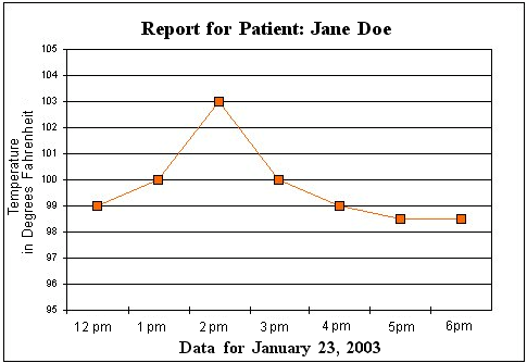
The values on the X-axis should be continuous or ordered, such as times or temperatures. Discrete categories or categories that do not have an order — such as salespeople or products — are better suited to column graphs.
The following options are available for Line and/or Scatter graphs:
- Stacked: When graphing multiple series, stack the lines for the series in each category.

- Horizontal: Make the X-axis the vertical axis and the Z-axis the horizontal axis.

- Displaying lines and/or points
You can:- Show Points: Each value appears as a dot in the graph.
- Show Lines: Only lines appear in the graph.
- Show Both: Lines and Points appear in the graph.
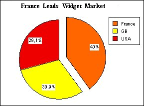
Pie charts show data as a percentage of a whole. Your data does not need to be expressed as percentages; 4D Chart automatically converts the data into percentages when it creates the pie chart.
Each pie chart can have only one series. Categories are displayed in the legend.
The following option is available for pie charts:
- Start Angle: Use this option to specify the rotation of the chart. The specified angle determines the placement of the first edge of the first category in the chart.

You can “explode” a pie chart by pulling one or more wedges away from the center of the pie:

To explode a wedge from a pie chart, hold down the Ctrl key (Windows) or Command key (Macintosh) and click a wedge of the pie chart to select it. Drag the wedge away from the center of the pie. When the wedge is where you want it, release the mouse button and the Ctrl key (Command key on Macintosh).
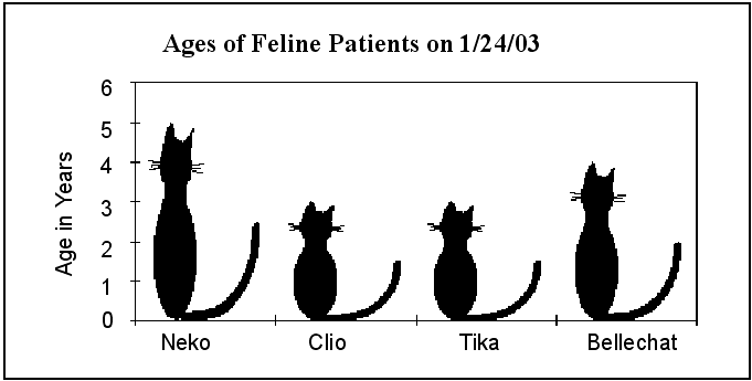
Picture graphs are similar to column graphs, except that you can substitute a picture for the column.
The following options are available for Picture graphs in 4D Chart:
- Stacked: When graphing multiple series, stack the pictures for the series in each category.

- Stacked, proportional: When graphing multiple, stacked series, show the series as proportions of a 100% whole.

- Horizontal: Make the X-axis the vertical axis and the Z-axis the horizontal axis. This option creates a bar picture graph.

- Overlap: When graphing multiple series, use this option to specify the percentage by which the series within each category overlap.
- Gap Width: Use this option to specify the spacial gap between the picture columns from one category to the next. The larger the gap, the narrower the picture columns.
You also have specific options for aligning and adjusting pictures:
- Alignment: This option specifies the horizontal alignment of the picture: center, left, or right.
- Vertical:This option specifies how the picture uses the vertical space of the column. The options are: clipped, stretched, and stacked (see table below).
- Horizontal:This option specifies how the picture uses the horizontal space of the column. The options are: clipped, stretched, and stacked (see table below).
The following table explains the Vertical and Horizontal options:
| Clipped | If the picture is too tall or too wide to be displayed in its entirety, it is truncated at the edges of the column. The proportions of the picture remain unchanged. |
| Stretched | The picture is stretched or shrunk so that its dimensions match those of the column. |
| Stacked | If the picture is either too short or too narrow to fill the column, the picture is repeated until the column’s height or width is reached. When the edge of the column is reached, the picture is truncated. |
When you create a picture chart, the columns are filled with a default picture.

You can add your own picture for each series by pasting it from the Clipboard. To do this, first make sure that the picture you want to paste into the column is on the Clipboard, then hold down the Ctrl key (Windows) or Command key (Macintosh) and click a column of the desired series. All the columns are then selected. Choose Paste from the 4D or 4D Chart Edit menu (or use the standard shortcut Ctrl+V under Windows or Command+V under Mac OS). The picture is pasted into each column for the series.You can repeat this process for each series.
To recover the standard picture, apply a different chart type then re-apply the 2D Picture type.
Each data point in a scatterplot represents a pair of values. The X-axis is also a value axis.
When the 2D XY type is selected, the option Category is replaced with Values (X) in the Chart>Axis, Chart>Grid Lines and Chart>Titles menus.
- Plots shape: You can display None, Circles, Squares, or Star plots.
- Lines appearance: You can display None, Straight, or Arrows lines.
- Show Regression Line (y = ax+b): Allows viewing the predictive relation between the X- and Y-axis values (if appropriate).
There is one regression line for each series of points. Using Ctrl+click (Windows) or Command+click (Mac OS), you can select the points associated with the regression line.
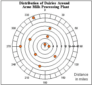
Polar charts are used to show the distribution of data around a central point. In a polar chart, each point is plotted in terms of degrees from the zero point and distance from the center.
Each data point on a polar chart is plotted using one Z-axis field to specify the angle in degrees and a second Z-axis field to specify the distance from the center.
Product: 4D
Theme: Using 4D Chart
Camembert***


