
4D v13
Customizing the axes
 Customizing the axes
You can customize many aspects of each axis of a graph. More specifically, you can:
- Customize the axis labels,
- Reduce the number of labels displayed on the X or Y axis,
- Customize the tick marks,
- Chang the scale of the Values axis,
- Reverse the order of data points on an axis,
- Position the origin,
- Add axis titles.
The following table explains the axes available in two-dimensional (2D) and three-dimensional (3D) graphs:
| Number of Axes | Axis Name | Axis |
| Two (2D Graph) | Category | X |
| Series | N/A | |
| Values | Z | |
| Three (3D Graph) | Category | X |
| Series | Y | |
| Values | Z |
You can display the Axis dialog box for any axis by choosing the appropriate axis from the Axis submenu of the Chart menu.
Using the Axis dialog box, you can change the location of the axis labels, tick marks, and origin. You can also change the scale used for the Values axis and reverse the order of the items graphed on each axis. The options available depend on the axis selected. Below is the Category Axis dialog box which enables you to customize the Category and Series axes:
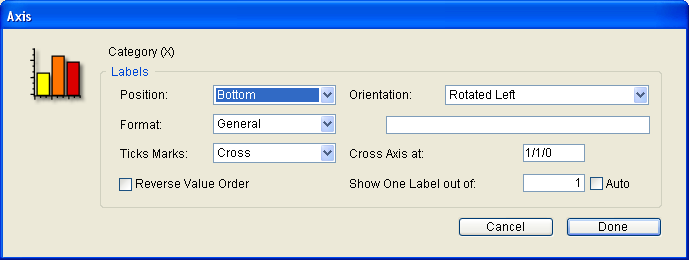
4D Chart automatically labels the axes when it generates a graph. You can change the position, orientation, and format of the labels, or you can decide not to display them with your graph.
- Label Positions
You can choose one of the following label positions from the Position drop-down list:- None
- Top
- Bottom
- Left
- Right
When the position is None, the label does not appear on the graph.
- Label Orientation
The following label orientations are available for each axis: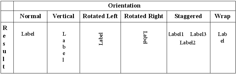
- Label Formats
You can change the way data in your labels is displayed by using display formats. For instance, you can use a display format to display dollar amounts using the dollar sign ($), commas, and decimals.
The following table shows some examples of the effects of display formats:Data in Default Format Display Format Data in Display Format 3400 $###,###.00 $3,400.00 3/4/11 Month Date, Year March 4, 2011
When you select one of the formats from the Format drop-down list, it is entered into the Format text box, located to the right of the drop-down list. If you want to use a custom format, you can enter it in that area. You can use one of 4D’s built-in formats, edit a format, or create one of your own. For more information, see GET LIST ITEM PARAMETER.
- Labeling Data from Boolean Fields
If you create graphs using Boolean fields from the database, the default axis labels are “0” and “1”, corresponding to FALSE and TRUE. You can label your graph more informatively by changing the label format. To create more meaningful labels for Boolean fields, change the label format to the following:
TrueLabel;;FalseLabel
For example, you might change the format to “Female;;Male” or “Experimental;;Control”.
You can reduce the number of labels displayed on the X-axis or Y-axis of a graph. This feature is useful when you create graphs with a large number of categories (more than 100).
When this option is used, 4D Chart displays only one label per N labels on the selected axis.
To use this option, enter a value between 2 and 255 in the Show One Label out of box. For example, if you enter 10, 4D Chart will display one label per 10 categories. The value 1 is the standard setting (all labels are displayed).
This parameter applies both to 2D graphs (categories for X-axis) and 3D graphs (categories for X-axis and Y-axis).
- Auto: If you check the Auto box, 4D Chart will calculate the appropriate number of labels to display, according to the amount of room.
Tick marks show the increments of the axes. You can choose among different styles of tick marks, or you can decide not to show the tick marks. You can customize this option for each axis in a two-dimensional graph. You cannot customize the tick marks for a three-dimensional graph.
The following tick mark styles are available:
- Cross
 ,
, - Inside
 ,
, - Outside
 .
.
You can change the minimum and maximum values. By default, 4D Chart uses the minimum and maximum value of the set of data being graphed. You can change these values, for example, to start the Z-axis at zero.
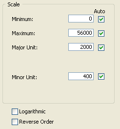
You can also modify the major and minor units for tick marks. By default, 4D Chart calculates these parameters based on the number of values to be shown and the size of the graph. If the values are dates, you can specify whether the major and minor units are measured in days, weeks, months or years.
For each scale display option, there is an Auto option which lets you enable the default operation of 4D Chart. If you want to use custom values, remember to uncheck the Auto option, otherwise your parameters will not be taken into account.
Note: The major and minor unit grid lines can be either hidden or displayed (see Showing and hiding grid lines).
- Using a Logarithmic Scale: You can change the scale from normal to logarithmic by checking the Logarithmic check box, located in the Values axis dialog box.
You can reverse the order of the data on an axis by checking the Reverse Order check box. This can only be done in a two-dimensional graph.
You can change the position of the origin — the place where one axis crosses another — for each axis in a two-dimensional graph.
- Changing the Origin of the Values (Y) Axis
The origin of the Z-axis is the value at which the Category (X) axis crosses the Z-axis. Usually, the origin is the minimum value on the graph or zero. Sometimes you will want to change the position of the origin. To change the origin of the Values axis, choose Category (X) from the Axis submenu of the Chart menu. In the Category (X) dialog box, enter a value in the “Cross Axis At” area. The value you enter is the numerical value of the desired origin position.
- Changing the Origin of the Category (X) Axis
The origin of the X-axis is the category at which the Values axis crosses the X-axis. Usually, the origin is placed to the left of the first category. Sometimes you will want to move the origin. To change the origin of the Category (X) axis, choose Values (Z) from the Axis submenu of the Chart menu. In the Values (Z) dialog box, enter a number in the “Z Axis Crosses at Category” area. The number you enter is the number of the category at which the origin should cross.
The categories are numbered from left to right, (or from bottom to top in a horizontal graph). The Z-axis crosses to the left of the specified category. To move the origin to the right of the last category on the graph, specify the number of categories plus 1. If the specified number is higher than the number of categories plus 1, the value is ignored and the origin is reset to the left of the first category.
You can add a title for each axis. Usually, the titles describe the data graphed on the axis.
- Choose the appropriate axis from the Titles submenu of the Chart menu.
The Titles dialog box appears. - Type the title into the “Title” text box.
- Choose a position for the title from the Position drop-down list.
This specifies the position of the title relative to the graph. You can choose one of the following title positions:- None
- Top
- Bottom
- Left
- Right
The default position is None. When the position is None, the title does not appear on the graph.
- Choose an orientation for the title from the Orientation drop-down list.
The following orientations are available for each axis:- Normal
- Vertical
- Rotated Left
- Rotated Right
- Click OK.
Product: 4D
Theme: Using 4D Chart


