
4D v13
Customizing the display
 Customizing the display
When you create a graph, its initial size corresponds to the size of the window in which it is created.
If the graph is created using the Tools>Chart... menu command of 4D, its size corresponds to the default size of a 4D Chart external window. If the graph is created from a 4D Chart window, its size corresponds to that of the window.
You can resize a graph in two ways:
- By resizing the window in which it is displayed. A graph is “unified” with the window where it was created as long as its own dimensions have not been modified using the selection handles.
To resize the window, click on the zoom box of the window where the graph is displayed and drag the mouse. The graph displayed is resized along with the window itself. You can only do this when the dimensions of the graph have not been modified inside the window.
When you resize the graph this way, proportional resizing is not possible. This works the same way as when you switch to full window display for a 4D Chart area included in a form. - By directly resizing the graph in the window using the selection handles (black squares that appear around the object when it is selected). Once you have done so, the graph is no longer “unified” with the window.
Hold down the mouse button on a selection handle and drag it up, down, or diagonally. If you drag a side, either the height or the width changes. If you drag a corner, the height and width change.
To resize the object so that the height and width retain the same proportion to each other, hold down the Shift key while you are resizing.
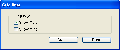
You can display grid lines for the major and minor increments of each axis. Grid lines can make a graph easier to read.
The major and minor increments are set in the Axis dialog box for the Values axis.
To display the grid lines for any axis, choose the appropriate axis from the Grid Lines submenu of the Chart menu. In the Grid Lines dialog box, click the desired check boxes:
You can display information for each series directly in the graph. You can display the following information:
- Values: The actual number or date, in Arabic numerals. You can show the values on the graph instead of using labels on the Values axis, or use them to supplement the axis labels.
- Percentages: The value of the data point divided by the sum of all the values in the category, as a percentage.
- Categories: The name of the category, identical to the axis label for the category.
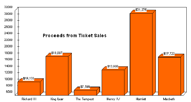
The following graph shows the values at the tops of the columns.
You can select the location at which the values, percentages, or category labels should appear, as well as their orientation and format.
This feature is not available for three-dimensional graphs:
- Choose Values from the Chart menu.
The Values dialog box appears.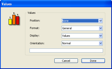
- Select the location at which the information should appear.
You can select one of the following options from the Position drop-down list:Pie Charts All Other Graph Types None None Inside Outside Top Outside Outside Bottom Inside Top Inside Centered Inside Bottom At Axis - Select the type of information you wish to display.
You can select one of the following options from the Display drop-down list:- Values
- Percentage
- Category
- Value & Percent
- Categories & Percent
- (Optional) Select a format from the Format drop-down list.
You can change the way values are displayed by using display formats. For instance, you can use a display format to display dollar amounts using the dollar sign ($), commas, and decimals. The following table shows some examples of the effects of display formats:
Data in Default Format Display Format Data in Display Format 3400 $###,##.00 $3,400.00 3/4/10 Month Date, Year March 4, 2010
When you select one of the formats from the Format drop-down list, it is entered into the Format text box, located below the drop-down list. You can use one of 4D’s built-in formats, edit a format, or create one of your own. For more information, see GET LIST ITEM PARAMETER. - Select an orientation from the Orientation drop-down list.
You can select one of the following options:- Normal
- Vertical
- Rotated Left
- Rotated Right
- When you are finished making your selections, click OK.
4D Chart automatically creates a legend for you when it generates the graph. By default, the legend is based on value labels. You can customize the legend’s location, order, and text. These parameters are available in the "Legend" dialog box that is available when a graph is selected (to display it, choose Legend from the Chart menu).
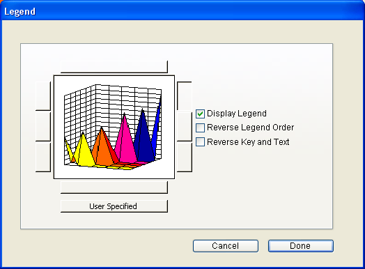
- You use the Display Legend option to display the graph legend. If this box is checked, the legend is displayed as part of the graph object. If this box is unchecked, the legend is hidden.
- The legend is part of the graph object. You can position the legend using the eight built-in legend locations, or you can move it using the mouse. You can move the legend anywhere in the document, including placing it inside the graph itself. In addition, you can display the legend vertically or horizontally. In other words, the series in the legend can be placed left-to-right or top-to-bottom.
- To use the built-in locations for the legend, select a legend position by clicking one of the model legends in the Location area. The location you choose will determines whether the orientation is horizontal or vertical.
- To position the legend with the mouse, click the User Specified button then validate the dialog box. In the graph, hold down the Ctrl key (Command key on Macintosh), click the legend and drag it to the desired location.
- You can reverse the order of the series in the legend. In addition, you can reverse the order of the legend key and legend text:
- Reverse Legend Order: Reverses the order of the series in the legend.
- Reverse Key and Text: If this check box is checked, the square containing the color or pattern code for each series is displayed after the series name.
A three-dimensional graph plots three fields or variables in three dimensions. However, you can add the appearance of a third dimension to a two-dimensional graph by adding “depth.” The third dimension does not represent the values of any of the fields or formulas plotted in the graph. By default, 4D Chart adds the illusion of depth to two-dimensional graphs. You can remove it to make the values in the graph easier to read, or modify the three-dimensional illusion.
To modify or remove the depth illusion in a two-dimensional graph, choose View from the Chart menu. The Depth dialog box appears:
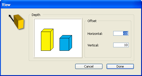
Modify the horizontal and vertical depth, measured in points, by typing values in the appropriate text boxes. To remove the depth illusion, enter zeros in both entry areas. You can also enter negative values to invert the axis of the three-dimensional illusion. When you press Tab or click outside a text box, the value you have entered is reflected in the Depth preview area.
You can change the perspective from which a three-dimensional graph is viewed. You can change both the rotation and the elevation of a graph.
To do this, make sure that a 3D graph is selected and choose View from the Chart menu. The 3D View dialog box appears:
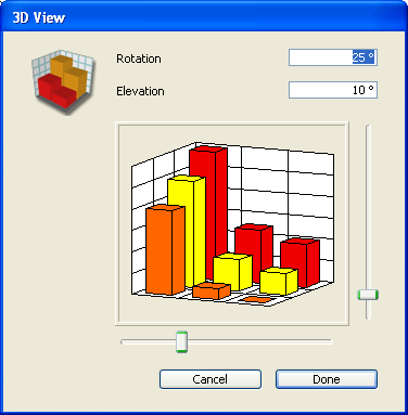
- You can change the rotation by entering a new value (from 0 to 90) in the Rotation text box or by moving the Rotation slider to the left or right. Rotation is the rotation of the graph around the Values axis.
- You can change the elevation by entering a new value (from 0 to 90) in the Elevation text box or by moving the Elevation slider up or down. Elevation is the rotation of the graph around a horizontal line perpendicular to the Values axis.
In both cases, the model graph reflects the change you have made.
You can select individual graph objects (axis lines, grid lines, series elements, etc.) and change their graphic attributes, such as color, pattern, and line width. You can also change the font attributes of graph text objects (such as axis labels and titles).
To select an individual graph object, hold down the Ctrl key (Windows) or Command key (Macintosh) and click the object. The following graph objects can be selected:
- Each series in a two-dimensional graph,
- Each of the three visible sides of a series in a 3D graph,
- Each axis (includes the tick marks),
- Axis labels for each axis,
- Major grid lines for each axis,
- Minor grid lines for each axis,
- Titles for each axis,
- The legend,
- Values displayed for the series.
After you have selected an object, you can modify its graphic attributes using items in the Object menu:
- Fill Pattern: The pattern displayed inside the border of an object. All objects except lines have fill patterns.
- Fill Color: The color displayed inside the border of an object.
- Line Pattern: The pattern of a line or border. The default line pattern is solid.
- Line Color: The color of a line or border. The default line color is black. The color palette used for Fill Color is also used for Line Color.
- Line Width: The width of a line or border measured in points. The default line width is 0.25 points (also called a hairline).
Text attributes apply only to axis labels, axis titles, legend text, and series values. Each of the following text attributes can be changed in the Text menu:
- Font: The typeface of the text.
- Size: Font size is measured in points.
- Style: Styles include plain, bold, and italic. The default style is plain.
- Color: The default color is black.
You cannot change the justification of graph text. You can only change the justification of text added with the Text tool.
Product: 4D
Theme: Using 4D Chart


